Concept Exploration — Not Official
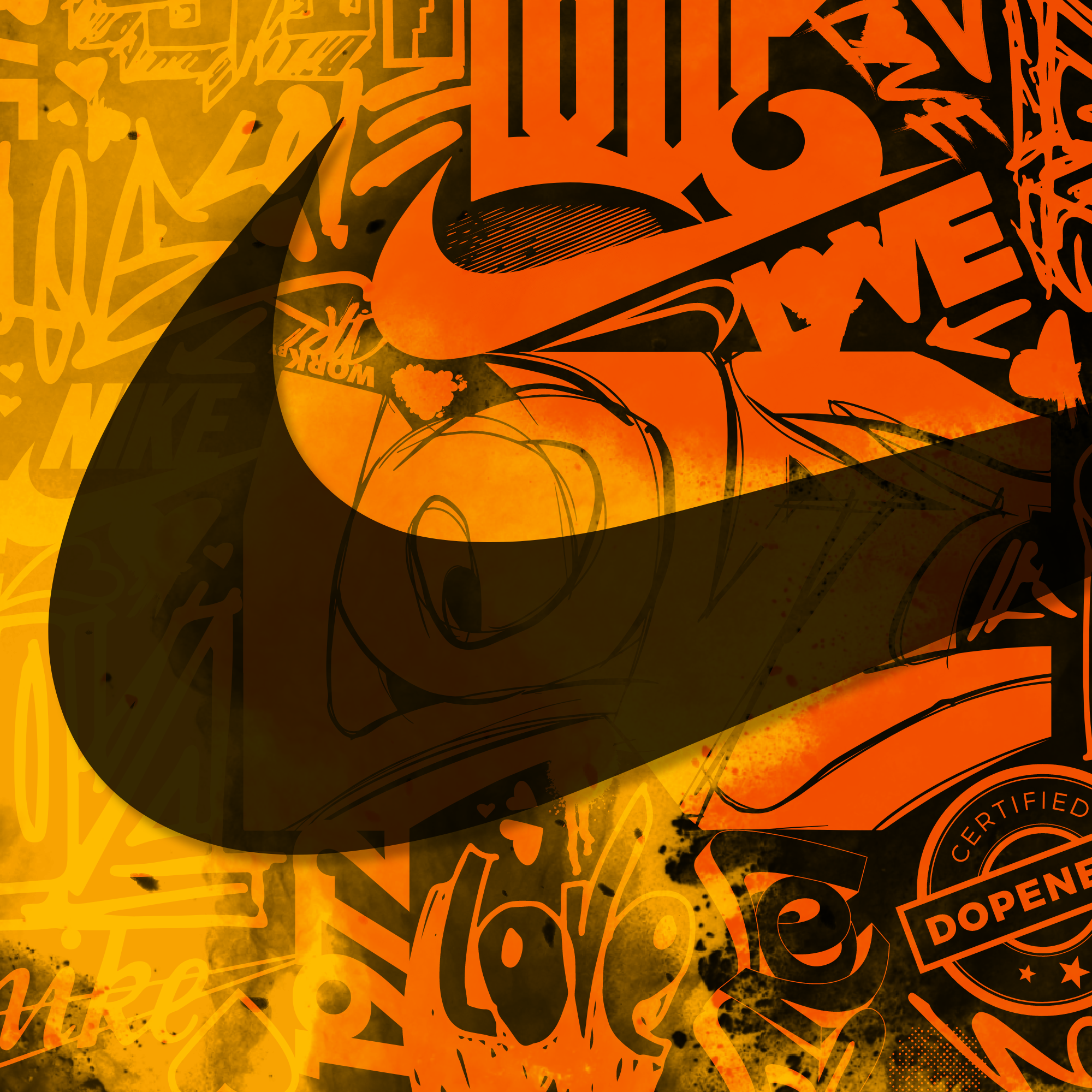
Nike has always been one of those brands that pushes creativity beyond the product. This project was an opportunity to explore how my illustration work could intersect with that mindset through a series of conceptual campaign executions.
Combining Nike photography with hand-drawn artwork, I developed visuals that imagine the campaign across multiple channels, from digital experiences to large-scale brand moments. The focus was simple: create something that feels powerful, expressive, and rooted in movement.
A dream collaboration brought to life through illustration, design, and a love for the culture that inspires both.
Visual Merch and Digital Assets
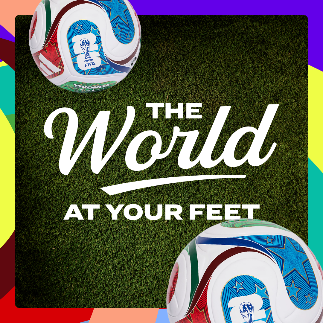
Global sporting events create unique opportunities to connect with customers across every channel. For this project, I partnered with cross-functional teams to extend existing World Cup creative into a cohesive retail and digital campaign experience.
My role included developing a visual guide for in-store execution, providing clear direction for how the campaign should come to life within the retail environment. Alongside the in-store materials, I designed supporting assets for email, social media, and ecommerce, ensuring consistency across each customer touchpoint.
By connecting physical and digital experiences through a unified creative approach, the campaign delivered a seamless brand presence throughout the World Cup season.
Coach – Spec Ad Concept
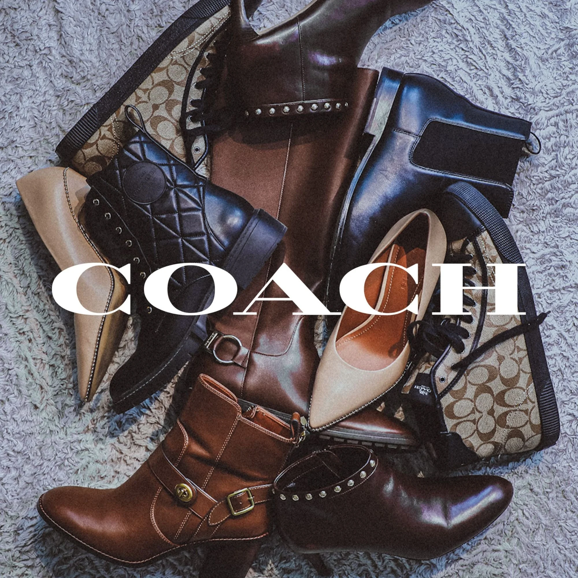
I’ve always admired Coach’s balance of timeless design and modern edge, so I decided to explore what it might look like to creatively collaborate with the brand.
I started by photographing pieces I’ve collected for my wife and myself over the years—products I already had a genuine connection to. After retouching the images, I dropped them into a few of Coach’s existing layout templates to build out a series of spec ads. The result? A visual direction that I believe holds its own alongside their official campaigns.
Next up: Phase two—mocking up original product concepts with custom graphics and packaging. Stay tuned.
Digital Design – Magellan Outdoors x Busch Light
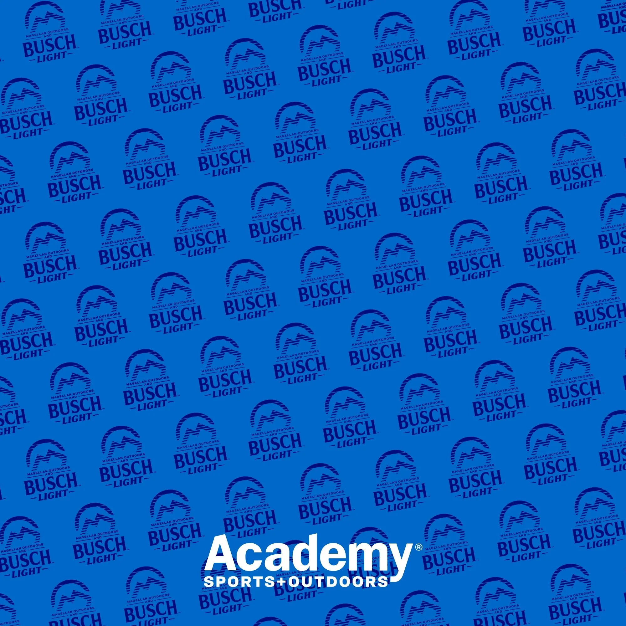
This was a quick-turn project I jumped in on to help bring the design across the finish line. Academy Sports + Outdoors’ private label, Magellan Outdoors, teamed up with Busch Light for a limited collection of branded gear. Using the approved design kit and curated photography, I created digital assets and developed additional packaging to support the launch.
Deliverables
Social Media Assets
Packaging Design
Email Design
Academy Sports + Outdoors – Diamond Sports Campaign
As a Senior Graphic Designer at Academy Sports + Outdoors, I lead the development of creative assets across digital and print, with a heavy focus on digital-first campaigns.
This particular campaign was built around our Diamond Sports Baseball category. I was responsible for the full suite of creative, including elevated email designs, paid social ads, and a feature in our seasonal print magazine. The goal was to create a cohesive, high-impact experience that translated seamlessly across platforms—and connected with players and fans alike.
Album Cover Art
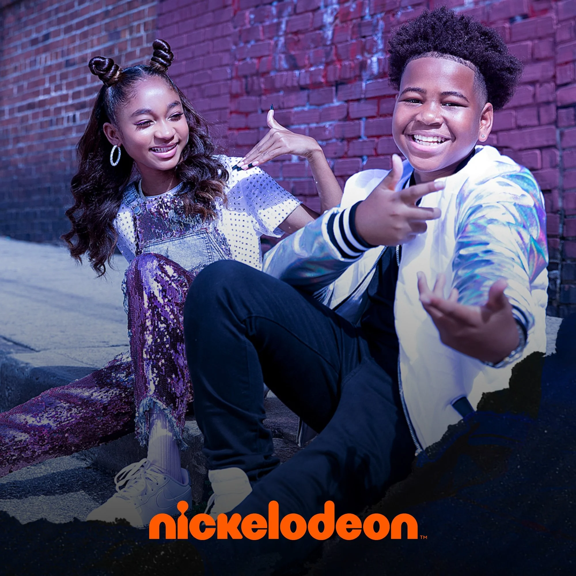
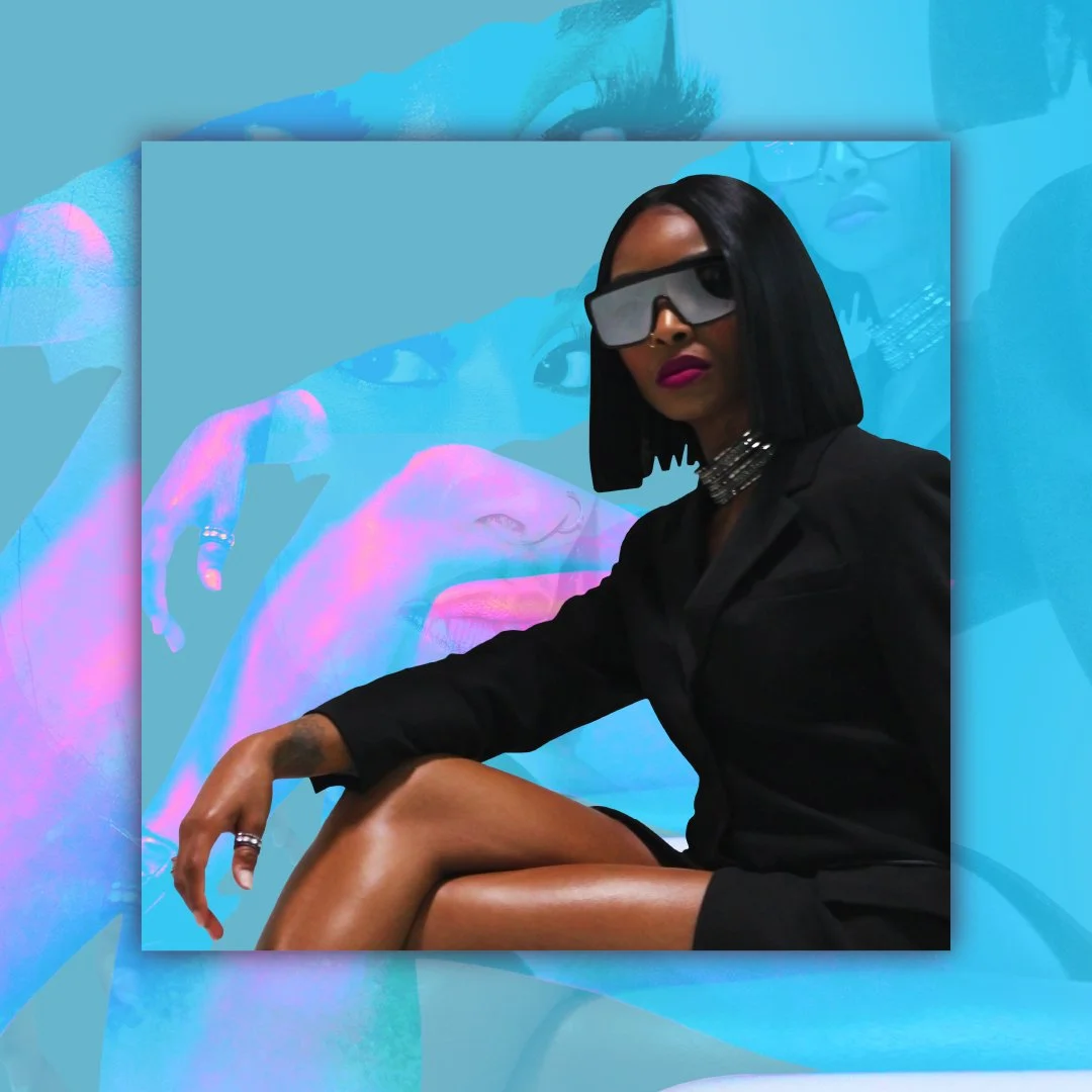
I had the opportunity to design cover art for Nickelodeon’s rising stars, That Girl Lay Lay and Young Dylan. The initial direction leaned into bold, energetic visuals aligned with Nick’s playful brand. In the end, the client opted for a more toned-down, mature aesthetic—but we still found ways to weave in that signature Nickelodeon flair to keep it feeling authentic and on-brand.
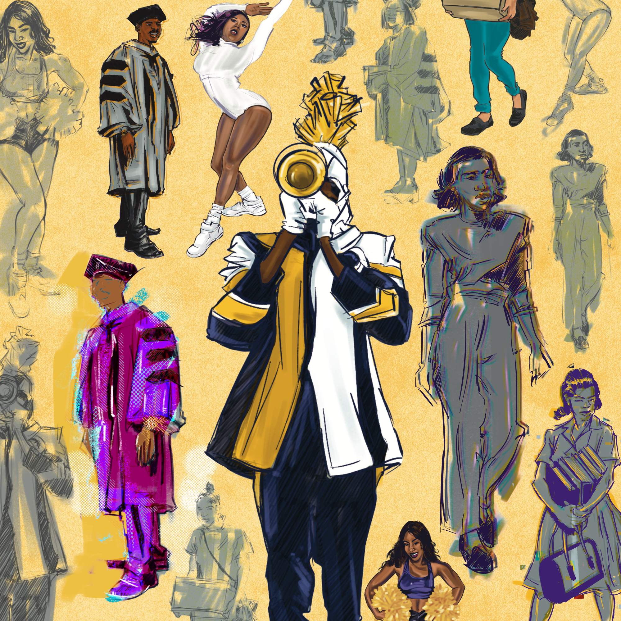
Campaign Direction & Multi-Format Brand Rollout — Prairie View A&M
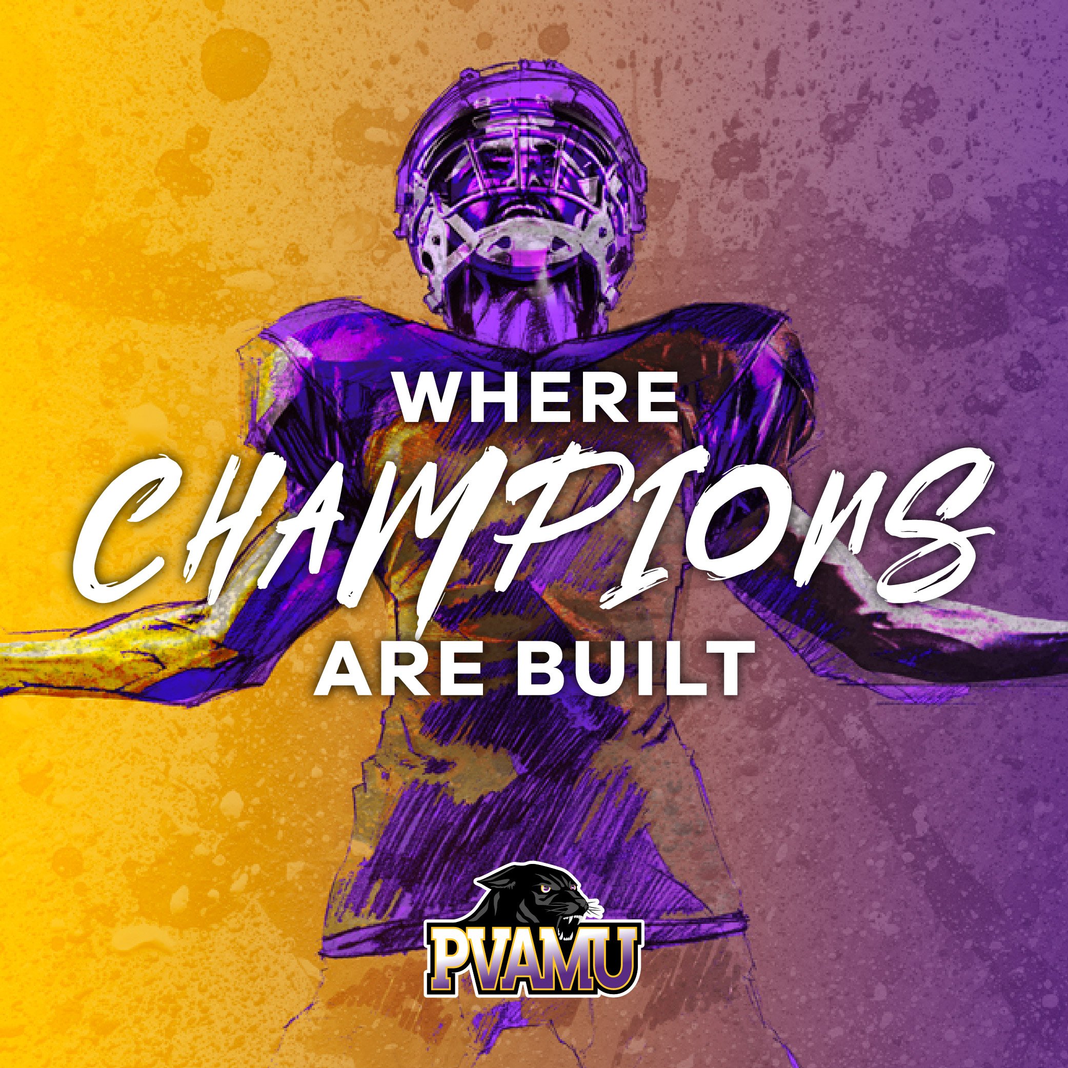
PVAMU’s marketing team needed their new athletic platform, Where Champions Are Built, translated across a campus and a fanbase. More than just a single asset, we created a visual system that would hold up on a wall, a screen, and in print simultaneously.
Working within their existing brand guidelines, I led development of the campaign’s creative range. This included wall graphics, digital content, and printed materials. I partnered closely with their marketing manager to keep the work grounded in what would actually resonate with students, not just what looked good in a deck. The throughline across every format was intentional: bold, energetic, unmistakably PVAMU.
Each asset had to work on its own and as part of a system, which meant establishing a visual hierarchy early and holding the line on it across every touchpoint.
Logo & Brand Design – Jesse Ray Miller
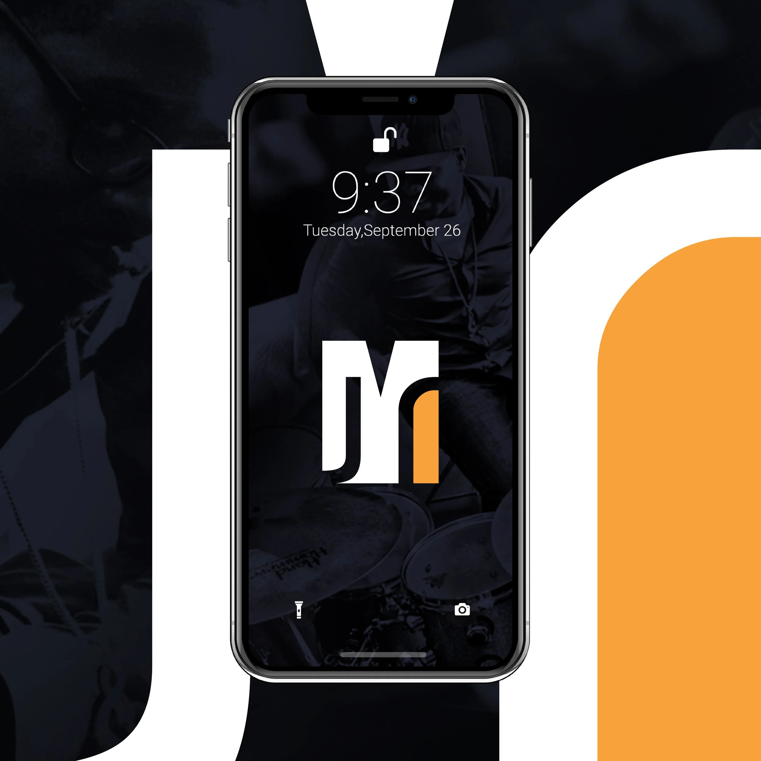
Early in my design journey, I collaborated with a friend on his personal brand identity. What started as a school project quickly became a passion project. I began with the logo, and as my skills grew over a few semesters, I started building out additional brand elements.
Although the full brand was never completed, I’ve kept this project in my portfolio because of what it represents. It marked one of my first wins—a student ADDY Award at the Buffalo competition—and gave me the confidence to keep pushing forward.
Campaign Refresh – City of Chicago
As a freelancer, I had the chance to work with the City of Chicago and the Mayor’s office to refresh a long-running campaign. My role was to build on the existing creative—updating it with bold color choices, new graphic treatments, and more current photography to give the campaign a renewed sense of energy.
We focused primarily on digital assets, along with a few small-format print pieces. The goal was to keep the spirit of the original intact while making it feel fresh, modern, and ready to engage a new audience.
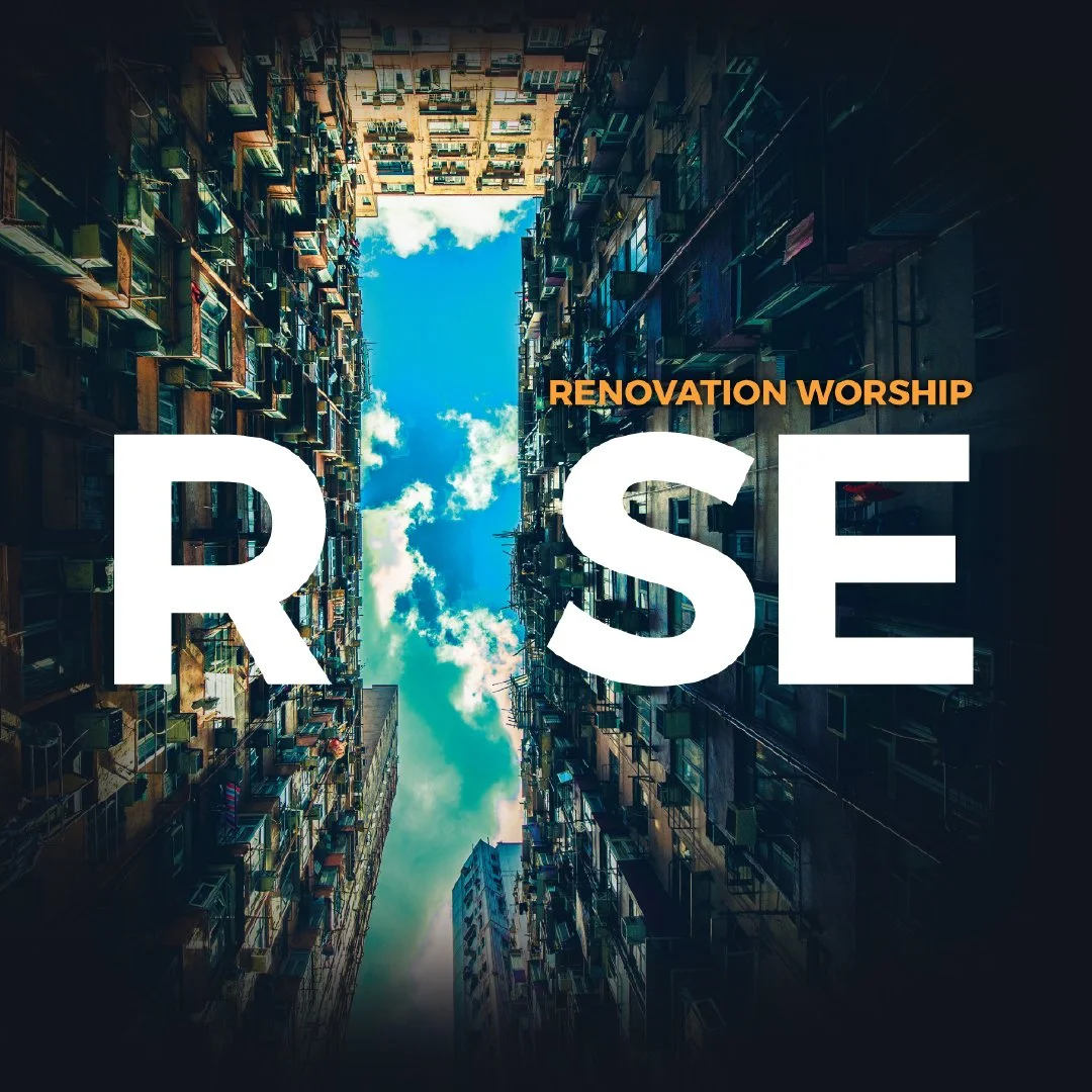
Album Cover Art
Album Cover Art
WIP Exploratory Concepts — Not Official
What would it look like if…
Apparel Art – LOVE Design
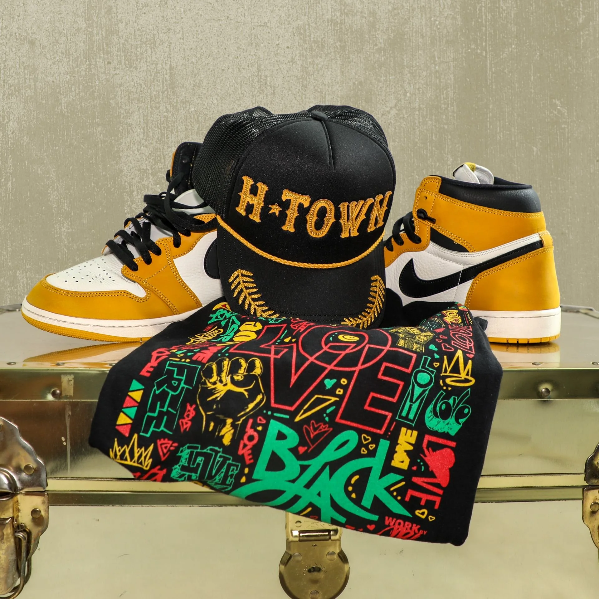
Ahead of a Trap Art showcase I was invited to, I created a small collection of apparel to sell at my table. The vibe of the event called for something bold and energetic, so I leaned into that—designing pieces that stood out, with a few more low-key options in the mix.
This collection was an extension of my ongoing LOVE design work, bringing the concept to life through wearable art.
Villa Maria College Mural
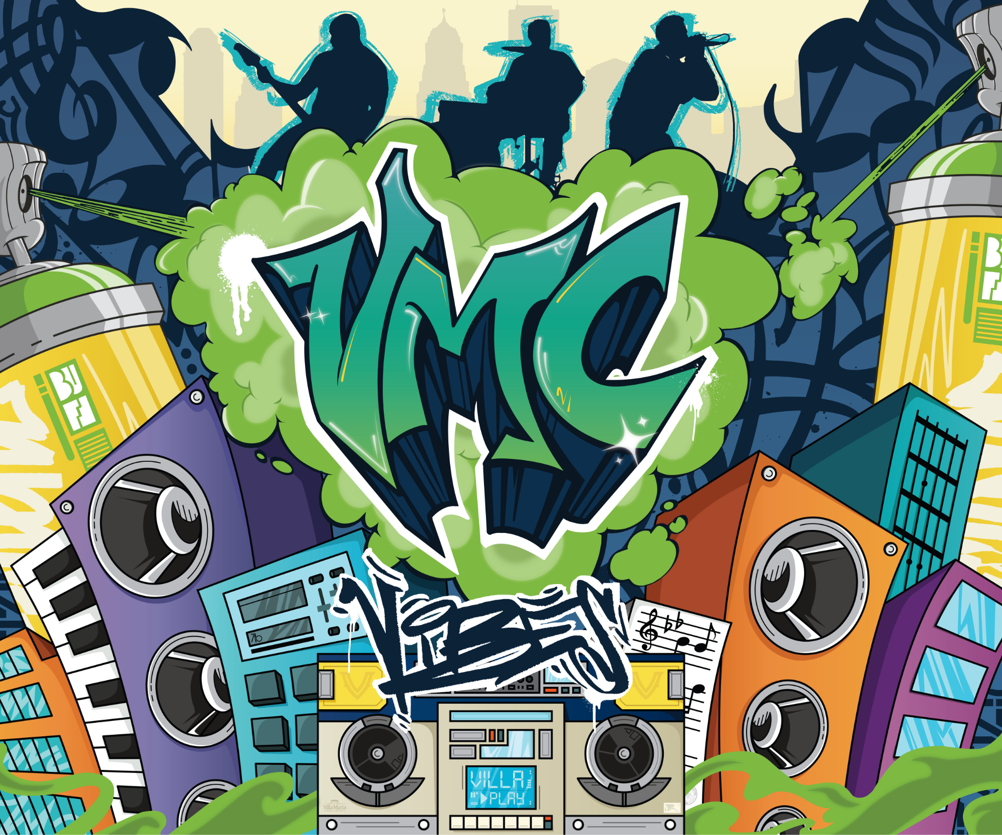
I had the opportunity to illustrate a mural for my alma mater, Villa Maria College—a project that was meaningful on multiple levels. It’s not every day your first mural takes shape in a place that helped shape you, and the fact that it celebrates a music genre that’s been so influential in my life made it all the more personal.
From initial sketches to final installation, this was the kind of creative process I genuinely love. Large-scale, community-facing, and rooted in culture—this is the kind of work I want to do more of.
If you’re ever in Buffalo, swing by the music building at Villa Maria College to check it out in person.
T-Shirt Art - Love Design
Designing art for apparel has always been a dream of mine. I’ve long admired major clothing brands, but more than anything, I’ve wanted to build something of my own. That mindset led me to create the LOVE design—a concept rooted in purpose and identity.
What started as a simple graphic has evolved into something bigger. This version takes cues from Juneteenth visuals, using color and collage to celebrate Black history. Creating meaningful, wearable art that honors our story—that’s always the goal.
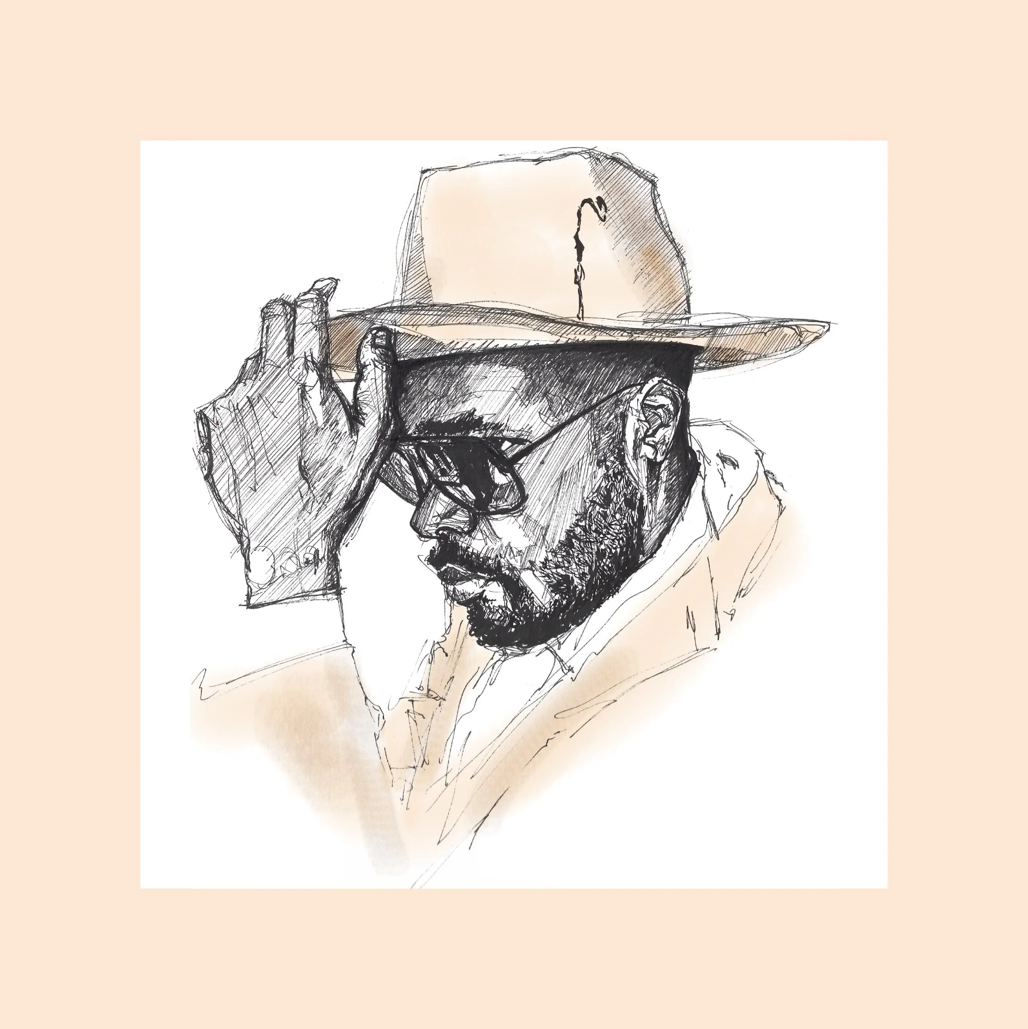
Pen Illustration
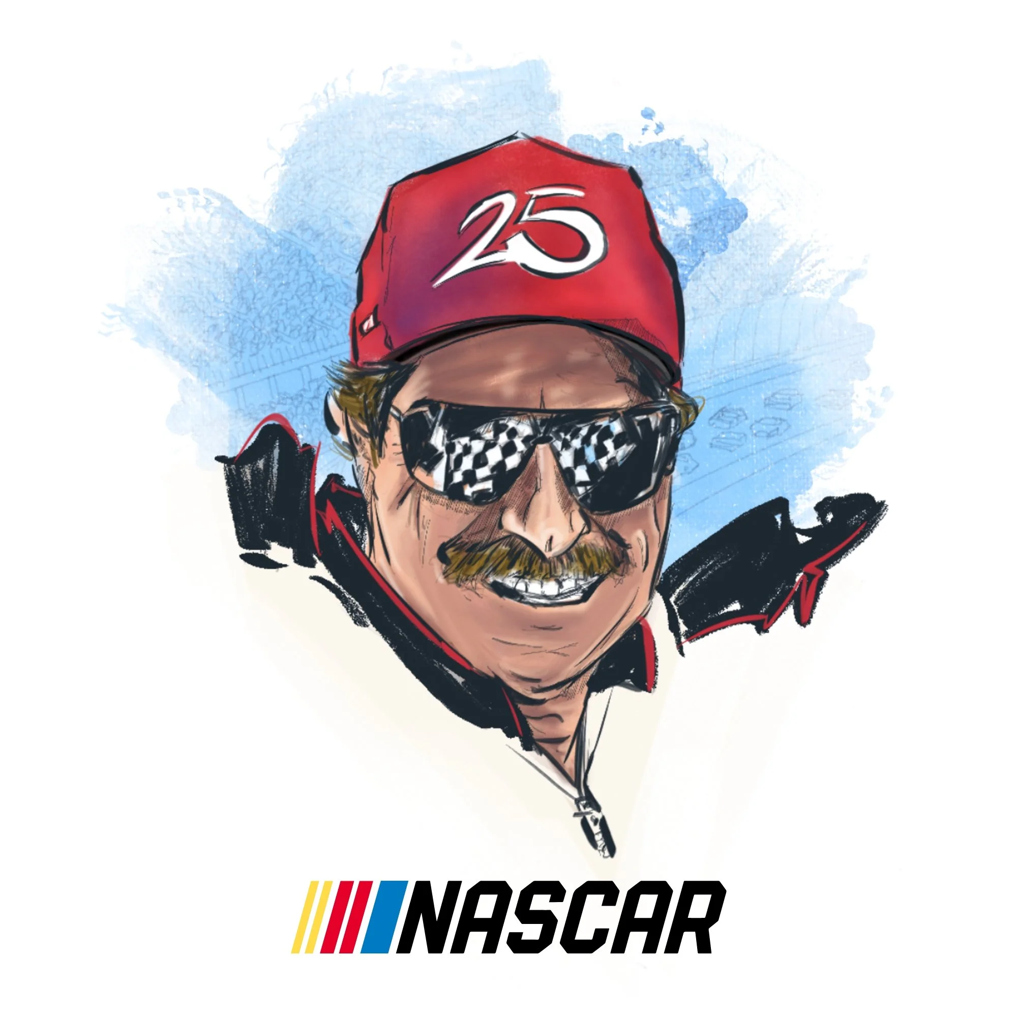
Editorial Illustration & Concept Direction — NASCAR
I connected with NASCAR to mark a milestone most fans still talk about: Dale Earnhardt’s 1998
Daytona 500 win, 25 years later. The brief was clear and open, use my illustration style to capture the weight of that moment for an audience that lived it, and make it land for one that didn’t.
I started in my sketch pad, working through pose and composition options using my Copic pens in my Rhodia pad before committing to a direction. My goal was to work through several concepts before landing on the composition that best captured the emotion of the win.
Once the direction was locked, I built out the final piece in Procreate and Photoshop, balancing realism with an illustrative style that could stand alongside NASCAR’s own brand photography. The finished piece ran across NASCAR’s website and social channels alongside their retrospective feature on Earnhardt’s legacy.
👉 View the article + illustration
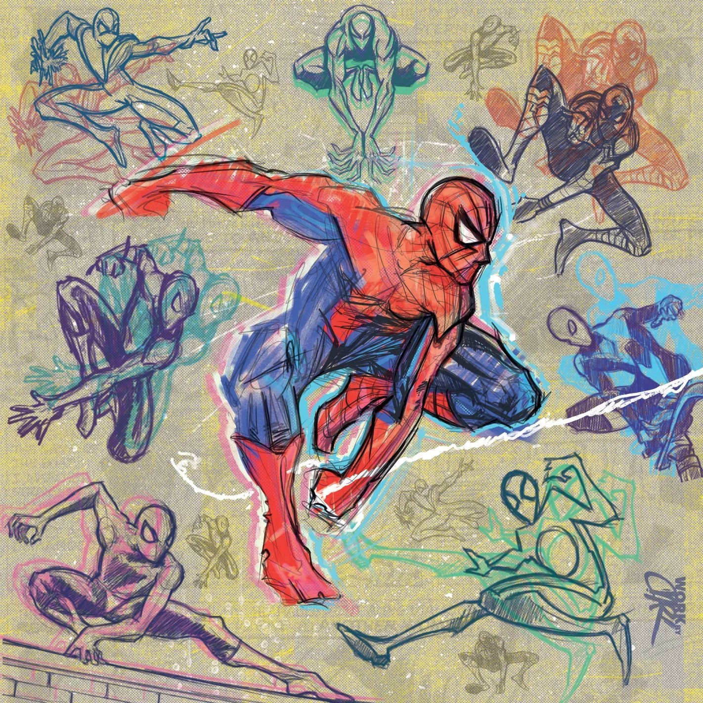
Spiderman Illustration - Digital + Paper
Spiderman’s easily one of my top 10 heroes—his poses are just too fun to draw. After watching the latest animated Spiderman film (and being blown away by the art direction), I felt inspired to create something of my own.
I started with a few paper sketches using Copic markers and pens, then brought it into Procreate, Photoshop, and Illustrator to build out a digital wallpaper. The style, the energy, the layered textures—it all pushed me to experiment and just have fun with it.
Editorial Illustration Direction — 2nd.MD
2nd.MD needed a visual story: how the image of “doctor” has shifted over 50+ years, told through editorial illustration. The challenge was balancing historical accuracy with a style clean enough to feel current and trustworthy.
I partnered directly with their in-house art director through several rounds of character development. As always, I started with my Copic pens to create loose sketches to keep the process fast and collaborative before any pixel was touched. That back-and-forth shaped the final visual language, a style specific enough to carry historical detail but restrained enough to read as premium editorial work.
Once direction was approved, I built out the full character set in Photoshop and Procreate, keeping every era visually distinct while unifying them under one cohesive style system.
Wall Mural Illustrations
Logo/Type Art
T-Shirt Designs
Barbershop Logo Illustration
Book Cover Illustration
Portrait Illustrations
Graffiti Wall Art
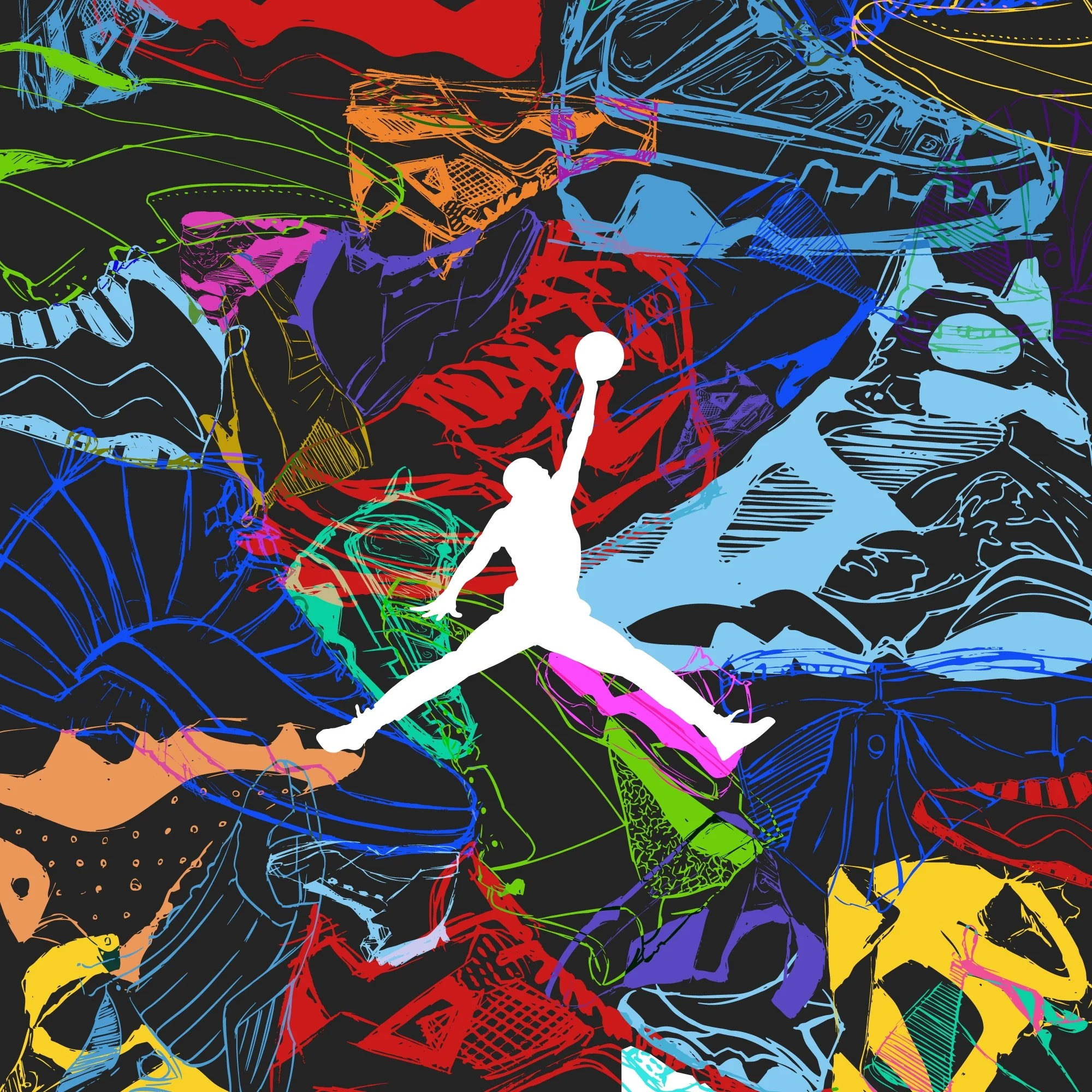
Poster Art - Love/Jordan Sneaker Concepts